

September 10, 2026
•
3 minute read
Clean, Calm, and Connected: Welcome to Our New Look!
One house, two distinct voices: How our plain-spoken approach brings clarity to riders and the trade alike.

Ryan Elson
Founder & CMO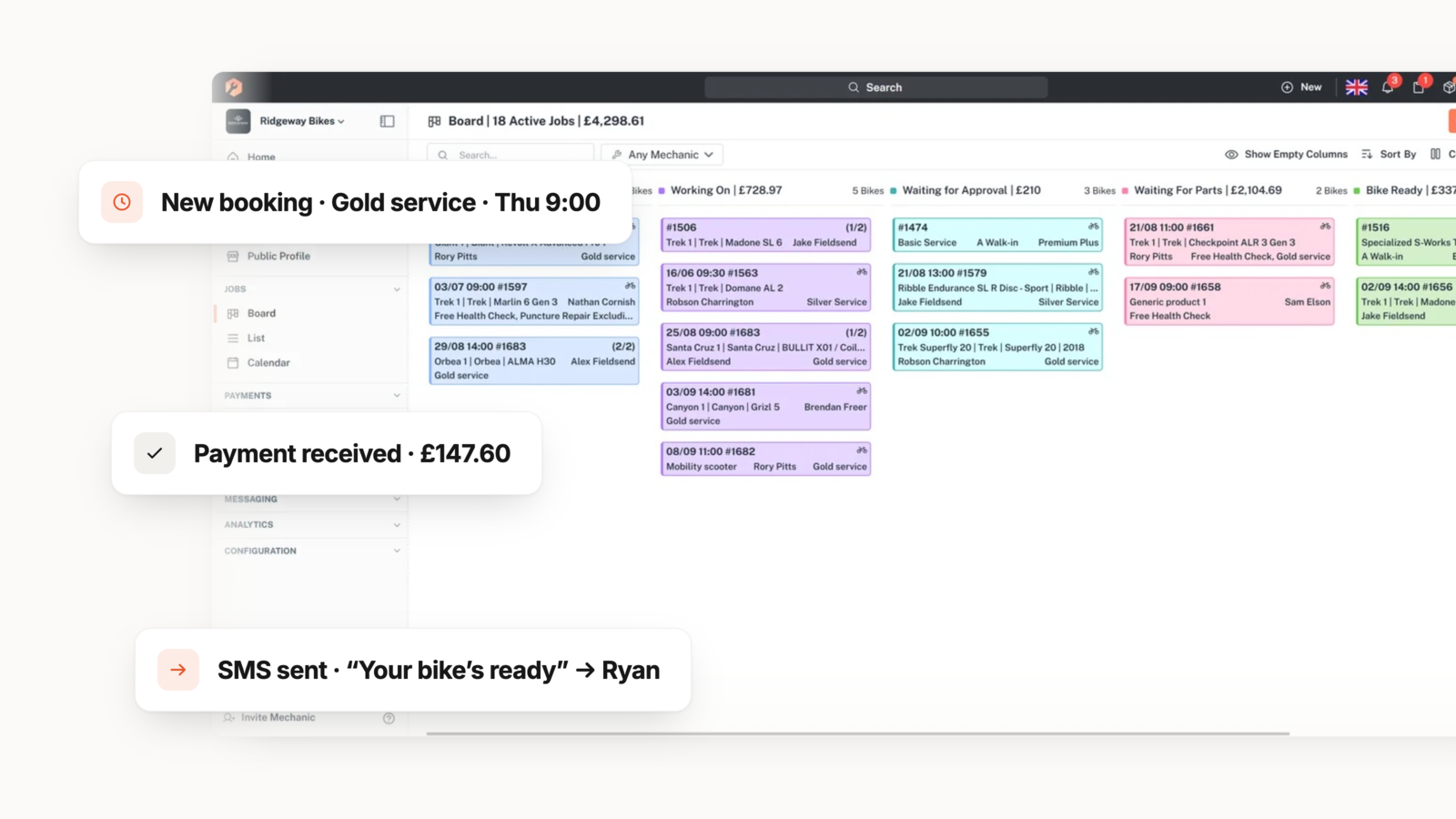
If you’ve stopped by recently, you might have noticed things look a little different around here. We are excited to officially unveil our brand-new branding page and updated visual system.
We run two distinct brands under one unified design house: bikebook, which speaks directly to riders needing effortless repair bookings, and Workshop, which powers the trade—the mechanics and service departments running the repair shops. This update brings our visual identity into complete alignment across the system while staying true to our hands-on mission.
Here is a look behind the scenes at what’s changed, the messaging principles driving the update, and what it means for you.
One House, Two Brands: Clear, Dedicated Roles
Our update isn't about making a loud statement—it's about creating clarity and consistency across every touchpoint. Every piece of work now fronts exactly one brand based on one simple question: who is this for?
- bikebook (For Riders): Built for the customer experience—finding a trusted local workshop, booking a repair in minutes, and following progress from drop-off to ready. The tone is warm, reassuring, and effortless.
- Workshop (For the Trade): Built for the businesses doing the fixing—software that manages bookings, jobs, stock, and payments. The tone is capable, plain-spoken, and calm.
Plain-Spoken Messaging: Concrete Over Hype
Alongside the visual refresh, we’ve doubled down on how we communicate. Both bikebook and Workshop speak like a trusted mechanic explaining a repair: concrete, brief, sure of itself, and completely free of hype or exclamation marks.
Our messaging framework relies on three core principles:
- Concrete Over Abstract: We name real things—the stand, the till, the job, your bike—rather than hiding behind vague tech jargon.
- The Reader Is the Hero: We write about the user's day, not our features. The shop keeps its evenings, and the rider gets their bike back smoothly.
- Promise Only What Happens: We stick to clear facts—telling riders they can "track every step" rather than making overhyped guarantees.
Whether it's helping a rider follow their repair "from drop-off to ready" or giving a shop owner the software to keep "your floor and your stand in sync," our copy is designed to put the user first.
Real Products, Honest Visuals
Our design philosophy carries directly into how we show our work. Moving away from abstract tech renders or staged stock photos, our system relies exclusively on real product screenshots and authentic shots of real working benches. What you see on our platform is always what you get in real life.
Take a Look Around!
We built this unified system to ensure every interaction feels seamless—whether you're booking a quick tune-up or running a service department.
Head over to our new [Branding Page] to explore the complete voice guidelines, download official brand assets, or review our partner messaging frameworks. We’d love to hear what you think—drop your thoughts in the comments below!



'%3e%3cg id='Final-Copy-2_2_' transform='translate(1275.000000, 200.000000)'%3e%3cpath class='st0' d='M7.4,12.8h6.8l3.1-11.6H7.4C4.2,1.2,1.6,3.8,1.6,7S4.2,12.8,7.4,12.8z'/%3e%3c/g%3e%3c/g%3e%3c/g%3e%3cg id='final---dec.11-2020'%3e%3cg id='_x30_208-our-toggle' transform='translate(-1275.000000, -200.000000)'%3e%3cg id='Final-Copy-2' transform='translate(1275.000000, 200.000000)'%3e%3cpath class='st1' d='M22.6,0H7.4c-3.9,0-7,3.1-7,7s3.1,7,7,7h15.2c3.9,0,7-3.1,7-7S26.4,0,22.6,0z M1.6,7c0-3.2,2.6-5.8,5.8-5.8 h9.9l-3.1,11.6H7.4C4.2,12.8,1.6,10.2,1.6,7z'/%3e%3cpath id='x' class='st2' d='M24.6,4c0.2,0.2,0.2,0.6,0,0.8l0,0L22.5,7l2.2,2.2c0.2,0.2,0.2,0.6,0,0.8c-0.2,0.2-0.6,0.2-0.8,0 l0,0l-2.2-2.2L19.5,10c-0.2,0.2-0.6,0.2-0.8,0c-0.2-0.2-0.2-0.6,0-0.8l0,0L20.8,7l-2.2-2.2c-0.2-0.2-0.2-0.6,0-0.8 c0.2-0.2,0.6-0.2,0.8,0l0,0l2.2,2.2L23.8,4C24,3.8,24.4,3.8,24.6,4z'/%3e%3cpath id='y' class='st3' d='M12.7,4.1c0.2,0.2,0.3,0.6,0.1,0.8l0,0L8.6,9.8C8.5,9.9,8.4,10,8.3,10c-0.2,0.1-0.5,0.1-0.7-0.1l0,0 L5.4,7.7c-0.2-0.2-0.2-0.6,0-0.8c0.2-0.2,0.6-0.2,0.8,0l0,0L8,8.6l3.8-4.5C12,3.9,12.4,3.9,12.7,4.1z'/%3e%3c/g%3e%3c/g%3e%3c/g%3e%3c/g%3e%3c/svg%3e) Your Privacy Choices
Your Privacy Choices